Histograms are essential tools in statistical analysis, providing a visual representation of the distribution of data. Understanding how to read and interpret histograms is crucial for medical professionals looking to analyze their patient data effectively. At StatisMed, we aim to provide medical doctors with the statistical analysis services they need to make informed decisions based on accurate data.
Table of Contents
What is a Histogram?
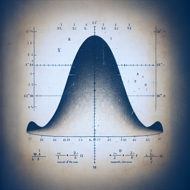
A histogram is a graphical representation of the distribution of numerical data. It consists of a series of bars that show the frequency or proportion of data within different ranges, or bins. Each bar represents a specific range of values, and the height of the bar indicates the frequency of data points within that range.
Histograms are commonly used in medical research to visualize patient data, such as blood pressure readings, cholesterol levels, or tumor sizes. By plotting this data on a histogram, medical professionals can quickly identify patterns and trends that may not be immediately apparent from raw numerical data.
Why are Histograms Important?
Histograms provide a clear visual summary of data distribution, making it easier to identify outliers, trends, and potential problems in the data. By understanding how to interpret histograms, medical professionals can make more informed decisions based on evidence and data-driven insights.
How to Read a Histogram
1. Identify the x-axis and y-axis
The x-axis of a histogram represents the range of values for the data being plotted, while the y-axis shows the frequency or proportion of data points within each range. Understanding the scales of the axes is essential for interpreting the data accurately.
2. Examine the shape of the distribution
The shape of a histogram can provide valuable insights into the underlying data distribution. Common shapes include:
- Symmetric: The data is evenly distributed around the mean.
- Skewed to the right: The data is concentrated on the left side, with a long tail to the right.
- Skewed to the left: The data is concentrated on the right side, with a long tail to the left.
3. Look for peaks and outliers
Peaks in a histogram indicate clusters of data points, while outliers are values that fall far outside the main distribution. Identifying peaks and outliers can help medical professionals understand the variations and patterns in their data.
4. Interpret the height of the bars
The height of each bar in a histogram represents the frequency or proportion of data points within a specific range. Higher bars indicate a higher frequency of data points, while lower bars signify less common values.
Conclusion
In conclusion, understanding histograms is essential for medical professionals looking to analyze patient data effectively. By learning how to read and interpret histograms, doctors can gain valuable insights into the distribution of their data and make informed decisions based on evidence and trends. At StatisMed, we are committed to providing medical doctors with the statistical analysis services they need to leverage the power of histograms in their research and practice.
If you are looking for professional statistical analysis services tailored to the needs of medical professionals, contact us today or request a quote to learn more about how StatisMed can support your research and practice.
[ad_2]